
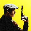
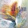
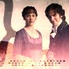
Requested by Wunderkind_Lucy. HERE.
Moderators: wild rose, SnowAngel
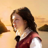
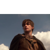
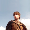
![]() by hyaline12 » Jun 16, 2010 12:54 pm
by hyaline12 » Jun 16, 2010 12:54 pm


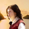
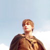
![]() by Wunderkind_Lucy » Jun 16, 2010 1:34 pm
by Wunderkind_Lucy » Jun 16, 2010 1:34 pm
 to this:


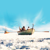
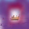
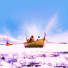
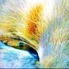
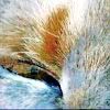
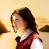
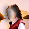
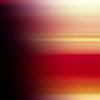
![]() by flambeau » Jun 16, 2010 4:35 pm
by flambeau » Jun 16, 2010 4:35 pm
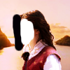
 to this:
  recreating this:
  (by me) and set it to Screen at 50%.
 to this:
 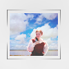 recreating this:
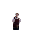
 set it to Soft Light at 100%.
 set it to Burn at 100%. Add a layer mask, and copy and paste the background layer into it. Now, mask out everything except Georgie.
 set it to Soft Light at 100%.
 (which I made with the help of another texture)

![]() by Kate » Jun 19, 2010 5:45 pm
by Kate » Jun 19, 2010 5:45 pm


![]() by violetfirekrazed » Jun 21, 2010 11:18 am
by violetfirekrazed » Jun 21, 2010 11:18 am
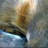

 and invert the colors. Set it to Lighten Only at 100%
 texture by me, and set it to soft light at 100% Erase the part over His eye.

![]() by Kate » Jun 21, 2010 5:09 pm
by Kate » Jun 21, 2010 5:09 pm


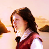
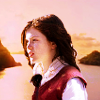
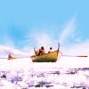
![]() by lover of narnia » Jun 22, 2010 9:32 am
by lover of narnia » Jun 22, 2010 9:32 am
 to this:
  recreating this:


 set this to screen at 100% and maneuver it over the text.

![]() by Djaq » Jun 23, 2010 3:38 pm
by Djaq » Jun 23, 2010 3:38 pm
 (I don't know who made it) And set it on Soft Light at 100%. Go to Filters>Blur>Gaussian Blur and blur it to about 20. This makes the line in the texture less defined.
 (again, I don't know who made it) Set it on Screen at 100%. Flip it horizontally and move it to the left (or whatever your image requires) and then use the blend tool to blend the edge of the texture. (sometimes, if you move a light-texture over, the edge of the texture shows up a little and makes a line. The blend tool helps get rid of that. I hope that made sense!)
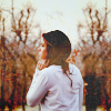
![]() by HM Swanwhite » Jun 28, 2010 12:27 pm
by HM Swanwhite » Jun 28, 2010 12:27 pm
 I inverted it and set it on Screen at 100 and position it where you want it.
 I set it on Screen at 9.

![]() by ForeverFan » Jun 30, 2010 9:28 am
by ForeverFan » Jun 30, 2010 9:28 am

 by luux_lu and paste it into a new layer. This set to multiply. And you're done! Enjoy!
 , and set it to overlay at about 50% or so to get a bit lighter of a colouring)

![]() by Kayla » Jun 30, 2010 12:12 pm
by Kayla » Jun 30, 2010 12:12 pm
 To This:


![]() by violetfirekrazed » Jun 30, 2010 12:34 pm
by violetfirekrazed » Jun 30, 2010 12:34 pm


 and set it to soft light at 80%
  flip it vertically and set it to soft light at 40%
 invert the colors, flip it horizontally. With your blur/sharpen tool, blur it at a rate off 100% until there are no distinguishable lines. Set it to soft light at 60%


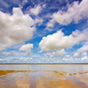
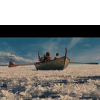
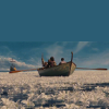
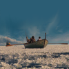
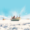
![]() by flambeau » Jul 01, 2010 10:48 am
by flambeau » Jul 01, 2010 10:48 am
 to this:
 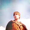 using Gimp. Translatable. ) and then extending the sky to fill the empty space at the top.
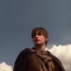
 (by ?) set it to Soft Light at 100%.
 (by ?) set it to Burn at 50%.
 (by ?) set it to Lighten Only at 100%.
 (which I made using the idea from Kate's tut. I suggest making your own and using whatever colors you want to make your image look good.) Set it to Soft Light at 100%.
 (by ?) set it to Screen at 25%.
 (by ?) set it to Soft Light at 25%.
![]() by Lady Courage » Jul 04, 2010 6:04 pm
by Lady Courage » Jul 04, 2010 6:04 pm
*is slightly nervous* To this:
 Enjoy!

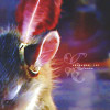
![]() by violetfirekrazed » Jul 12, 2010 12:58 pm
by violetfirekrazed » Jul 12, 2010 12:58 pm
 to THIS:

 by me. Invert the colors. Flip it vertically. Go to Filters>blur>Gaussian blur blur it with a radius of 21. Set it to soft light at 100%. by me. Rotate it -90.00 degrees. Set it to Multiply. The opacity for this will depend on you image, go with what looks best to you. Now, Filters>blur>Gaussian blur it with a radius of 21.
![]() by MissAdventure » Jul 22, 2010 9:50 am
by MissAdventure » Jul 22, 2010 9:50 am
 to this
  , recreating this
  .
. )
)
Users browsing this forum: No registered users and 8 guests