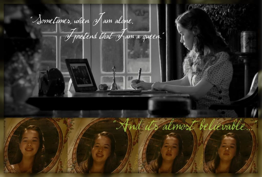
Another nice graphic to your credit DaughterofEve1792. I like your concept on this one. You've chosen a nice pairing between text and imagery. I particularly like the flow between the bottom mirror images in connection with the text. The flow is perfect- how Susan appears content ("I pretend that I'm a queen") and slowly, almost fades into the looks of doubt ("and it's almost believable"). This effect works really well with Susan's character and your concept. She only allows herself to be content for a brief amount of time before she brings herself back to her reality. The flow in Susan's facial expressions says it all- I can't say it enough. Really nice work here. I agree with wild rose on your choice of coloration. It works well conceptually. Maybe it's a bit cliche, but I could also see the bottom images changing coloration as well as Susan's expression changes (which could also be taken into consideration with the text). I'm not entirely sure on the overall layout of the piece. Does it work? Absolutely. Is it as strong as it could be? Personally, I'm not sure (but I do believe it's subjective). I can see the first two mirror images being placed at the top of the piece, followed by the grayscale image of Susan (as it is now), followed by the last two mirror images. To me, this seems to read more with the text. I'm certainly not saying that it's right though (afterall, in this format you do lose the flow of expression change, so.... it might just be something to play around with if you ever feel the urge or desire).
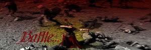
A great concept with superb text and imagery to match. Nice work

.


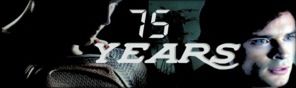


 I love the pictures you chose and the lyrics are perfect and the coloring is awesome!
