I have time to comment!

page 23
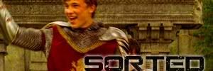
StarAsterisk--very pretty! Cropping and font choices on all them are very good. My favorite is 4.
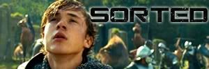
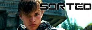
kev--

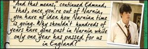
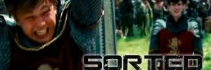
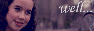
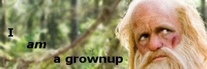
I love it! The text is exactly what I thought about Edmund while I was watching VDT.
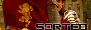
Radagast--good job on both of those! I like the coloring on the first one. On the second one, I would suggest switching the two pictures around making the sword on the right and Reep on the left. Since English is read left to right, that is often the way pictures are viewed as well. So, if the pictures were switched around they would "match" the text better so to speak.
wolfloversk--great job! I especially like the gremlin hunters sigs.
Electra--very good! I like 1 the best.
page 24
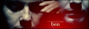
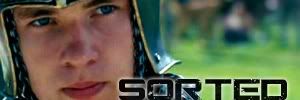
Beginte--(first posts)they're all gorgeous! I can't decide which one is my favorite. (second post) What a neat idea. I like 1 and 4 the best; they look so ominous. (third post) Very nice job on the Ben ones.
nz_narnia_nut--the coloring on both is beautiful.
Silver--
all of them are really good. I like 3 the best.
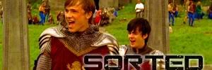
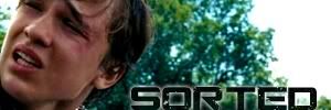
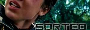
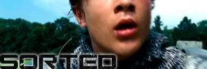
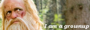
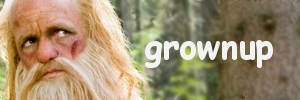
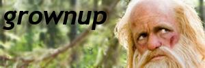
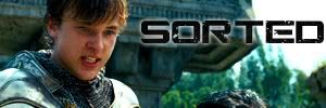
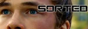
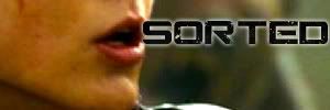
kev--(first post)they are funny! My favorite is 6. He looks so exhausted. (second post) More sorted? Wow. You've been busy. I like the variations in the cropping.
narnian_at_heart--good job on all of them! They're really great for your first ones. My favorite is 4.
Gwayne--they're all really good! The blending on a few of them is just a little bit off, but it will improve with practice.


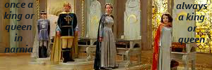
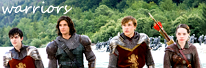
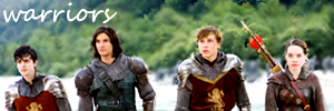
The text on 1-4 is from a song. But I forget which one it is.


Anyone may use. C&CC
 I hope to be a more diligent user of this thread, heh
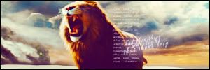
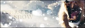


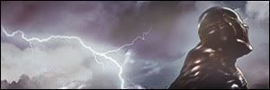


 visually stunning as always good on the lighting
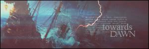
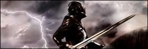