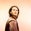
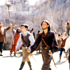
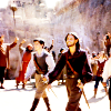
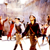
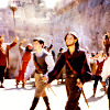
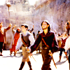
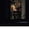
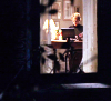
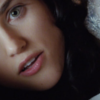
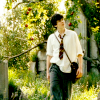
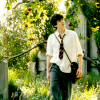
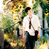
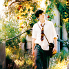
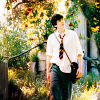
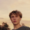
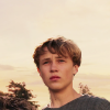
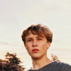
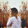
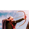
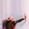
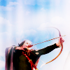
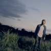
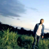
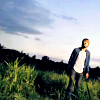
 to this:
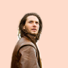
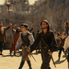
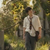
 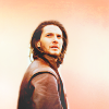 recreating this:
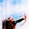
 Requested by lover of narnia.
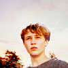
Open and prep image/base (crop, scale, etc). I began by painting around Caspian with color #fedbca.
Add a fill layer of color #d7e4f1, set it to Burn at 75%.
Add this:
 set it to Soft Light at 25%.
Add this:
 set it to Soft Light at 100%.
Add this:
 set it to Soft Light at 100%.
Flatten your image.
Duplicate, go to Colors>Components>Channel Mixer and input these settings...
Red: 100, -5, -5.
Green: -5, 105, +5.
Blue: -50, +85, +90.
Make sure Preserve Luminosity is unchecked.
Set that layer to Multiply at 25%.
Duplicate that layer (the channel mixer layer that you just set on Multiply) and move it below the Multiply layer. Set it on Normal at 35%, and erase everything except Caspian.
Flatten your image.
Go to Colors>Hue-Saturation, and input these settings in the Master channel: -2, 0, +15.
This step is optional. I added a transparent layer, set it on Soft Light at 100%, and added some highlights to my avatar with color #ffffff (white).
Add this:
 set it to Lighten Only at 100%.
Add this:
 set it to Lighten Only at 75%.
Add this:
 set it to Screen at 100%.
Add whatever else you want. You're done!
Please do not copy exactly.
----------------
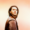
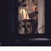
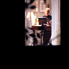
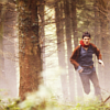
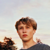
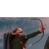
Tutorial #90 - This:
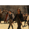 to this:
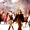
 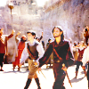 recreating this:
 Requested by lover of narnia.
Open and prep image/base (crop, scale, etc). I began by extending my base so it was tall enough.
Duplicate your base layer and go to Colors>Auto, and select White Balance. Set that layer on Soft Light at 100%.
Duplicate the above layer and set it on Screen at 100%. Duplicate the Screen layer two more times (you should have 3 Screen layers). Add a layer mask to the top Screen layer, and copy and paste the background layer into it. Invert the layer mask (Colors>Invert).
Flatten your image.
Add this:
 set it to Soft Light at 50%. Add a layer mask to this texture, and copy and paste this same texture into it. Invert the layer mask (Colors>Invert).
Add this:
 set it to Soft Light at 75%.
Add this:
 set it to Burn at 100%.
Flatten your image.
At this point, I added a transparent layer on Soft Light and added some subtle highlights to my image with a few light colors (white, cream, and light pink, I believe).
Flatten your image again.
Go to Colors>Components>Channel Mixer and input these settings...
Red: 100, 0, -6.
Blue: -44, +85, 100.
Make sure Preserve Luminosity is unchecked.
Set that layer on Screen at 25%. Add a layer mask, and copy and paste the background layer into it. Invert the layer mask (Colors>Invert). Merge that layer down.
I then added a transparent layer on Soft Light again, but this time I concentrated on darkening a couple of areas (specifically the shadows on the ground).
Go to Colors>Hue-Saturation and input these settings in the Master channel: +2, +5, +10.
I added a couple of lighten textures on Lighten Only and Screen, and then I was done!
Please do not copy exactly.
----------------
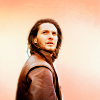
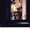
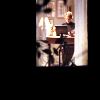
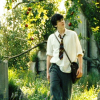
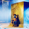
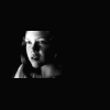
Tutorial #91 - This:
 to this:
  recreating this:
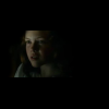
 Requested by Wunderkind_Lucy.
Open and prep image/base (crop, scale, etc).
Duplicate your base layer and go to Colors>Curves. Plot these points...
Value: x: 0. y: 12. | x: 105. y: 174. | x: 236. y: 255.
Red: x: 124. y: 137.
Blue: x: 21. y: 27.
Set that layer on Screen at 100%. Duplicate it and set it to Soft Light at 100%.
Flatten your image.
Go to Colors>Auto and select White Balance.
At this point, I extended the base by taking the rectangle select tool, drawing a selection around the window and inverting it, and then filling the selection with solid black.
Add this:
 set it to Soft Light at 100%. Flip it vertically. Merge it down.
I added a transparent layer on Soft Light, and added some highlights to select areas with color #fff0c8.
Add this:
set it to Lighten Only at 100%.Add this:
 set it to Screen at 100%.
Flatten your image.
Go to Colors>Hue-Saturation and input these settings in the Master channel: 0, +5, +35.
I added another transparent layer and added a few more highlights over her face.
Add whatever else you want! I added text on the original.
Please do not copy exactly.
----------------
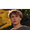
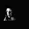
Tutorial #92 - This:
 to this:
  using Gimp. Translatable.
Requested by Wunderkind_Lucy.
Add your text in whatever font you wish (I used 'Folks', or a variation of it), and then duplicate your text layer so you have two layers of the same thing. In the layers dialog, right click on the bottom layer and select 'Layer to Image size'.
With that layer selected, go to Filters>Blur, and select Blur. Your text should now have that fuzzy 'glow' look around it. You can fiddle with the opacity of the blurred layer if you wish; I sometimes lower it to around 50-65%.
That's all there is to it!
----------------
Phew!! That's all, folks! I hope these were helpful! None of these textures are mine (except the final tutorial), and I cannot take credit for them.
--- flambeau

 (At least I hope so
  )
)
 ). This one is black on white background, so it's necessary to invert the colors. You can do it with your brush - pick the pure white color and set your brush on 'difference', opacity 100% and color the texture (don't take your finger off the mouse key until the clors are inverted completely). Or you can open a 100x100 layer of white and blend it with the texture, setting it on 'difference'. Merge the layers together.
 ). Because you want dark text, you don't have to do anything to the texture.

 to this:


 recreating this:
  set it to Soft Light at 100%.
 set it to Soft Light at 100%.
 flip it vertically, and erase the black part.
 set it to Lighten Only at 100%.
 set it to Screen at 100%. I smudged out the part over Peter because it made him too light.
 to this:
 to this:
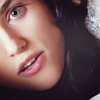
 , which follows the above tut exactly but for the texture.

 to this:
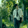
 set it to Soft Light at 100%.
 set it to Soft Light at 100%.
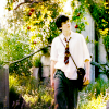
 to this:
  set it to Soft Light at 100%.
 set it to Lighten Only at 100%. Duplicate this layer so you have two of them, and flip the duplicate horizontally.
 set it to Soft Light at 100%.
 >
> 
 set it to Lighten Only at 100%. Duplicate it, and set it to Screen at 75%.
 to this:
 to this
  , recreating this
  .
. to this
  , recreating this
  .
. to this
  , recreating this
  .
. to this
  , recreating this
  .
.
 to this:
 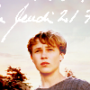 using Gimp. Translatable.
 >
>  >
> 
 and set it to Burn at 50%. Once again, Peter was too dark, so I
  >
> 

 set to Soft Light at 50%.
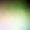 set to Soft Light at 25%.
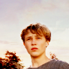

 On Soft Light at 100%.
 On Lighten Only at 100%.
 to this:
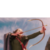
 ) and scaled the selection so that it was sized 100x200. (
 >
> 
 set to Soft Light at 50%. I added a
  set to Soft Light at 100%.
 set to Burn at 100%.
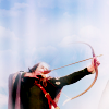
 set to Soft Light at 35%.
 set to Screen at 25%.
 to this:
 , recreating this:


 to this:
  , recreating this:

 to this:
 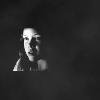 recreating this:
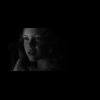

 to this:
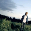
 set to Soft Light at 100%.
  I set the first one (the one on the bottom) to Soft Light at 25%, and set the second one (the one on the top) on Screen at 15%.
 to this: