I am truly awestruck Beginte. I'm not going to lie, I was multi-tasking when looking at this piece, so I forgot what I was looking at when I came back to it. That being said, when I came back to your piece and saw the preview, I honestly said to myself: "Wow, the poster for VDT is actually out now" (that is something that you should be most proud of

). Now on to the critique (mwahhaha.... my attempt at an "evil laugh"
).
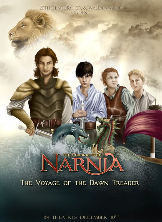
Character work looks great, the details are phenomenal (I love the work on Aslan's mane and the folds in the clothing). I think that the facial expressions and "looks" (meaning the likeness to the cast) of the boys all work well. Lucy looks a little off and I'm not sure if her expression is working at its highest potential. Also, Lucy's pose looks a bit "uncomfortable". Her left arm feels really tense and rolled forward (as if she is trying to block out Eustace or he's trying to push her out). Looks like there needs to be a line to connect Eustace's shirt sleeve, as it blends into the white background. From this image size, Edmund's hand looks a little... off. Proportion wise looks good, but the pose or something looks weird (maybe it's because I'm so used to seeing "hand over hand" on a sword hilt in this particular pose). Costume design looks good on all, they definitely feel like they belong in the same crew. I like how they still manage to all look different though. Also, I notice that the main light source seems to be coming from the left, while on the characters, the light source appears to be from the right. Obviously the characters may not be connected with what the BG light is doing, but it is something that I happened to notice.
Usually I'm pretty bummed when Aslan doesn't have a larger image on the Narnia posters. However, in this case, I think it's very effective in the way your layout is setup to have Aslan be smaller. As he is among the cloud imagery, I connect it back to being that he is the very sun and light that guides them in their journey, even to the very end of the world. Comes off as a very powerful visual reference. Nice work here. Now, I know you mentioned that the cloud imagery wasn't your own hand doing, but it does look fantastic.
On the BG imagery, is the line next to Caspian's right arm intentional, as a skyline? If so, I think it's too dark, becomes a bit of a visual distraction. If you were to take it out, I think it would still work in the 'blending' department because the water has a nice, soft edge to it. The details in the waves are also superb. I think it's very effective to have this detail and then to tamper off into just coloration as you get down towards the text. The sea serpent and the DT are also looking great. The coloration on the sail didn't bother me at all, though the water around the side of the ship did. The way the water covers the side almost looks like the DT is sinking (maybe you intended it to be that way seeing that it is in a battle with a sea serpent).
Lines of text work well. I like the intro. of Fox and Walden Media at the top with the main title towards the bottom. This is just personal preference, but I would move the "in theaters.." portion up just a tad (still keeping it in the coloration area, out of the "splash" area).
On a final note, I agree with Meltintalle. It would be really nice to see certain areas of this piece in more detail. I really want to see Rhindon up close to get the full effect of the "etched" text detail. You have done a fantastic job here Beginte. This is one of those pieces that I really wish was on the market for purchase. Nice work

.
 Enjoy the work and don't be too harsh on me in criticism, though constructive one is always OK.


 Oh well. I hope he fits into your next piece.


 20 out of five stars.
 )
) 


