Nice wp narnialover101. Design looks great. I know that everyone has their own preferences in layout, but I feel that the two images and the text may be getting, just slightly, too jumbled. Hmm, I think it may be because the first line of text sits within the top image while 'mouse' is free floating. It's debatable... and subjective. Your choice of text is a perfect match-up for your choices of imagery and for the concept of the piece. The two images are perfect reflections of each other as well, with the top version being the brave, swashbuckling version of Reep and the bottom one being a bit more humble and reflectful (I especially like how the bottom Reep appears to be looking up at the former version of himself, very effective as an added visual idea). The BG design is also superb, great layers and effects to provide an overall feel and design. Nice work

.


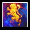
 But in spite of that, I love the coloring and the irony of the text ('specially with Aslan sitting right there)!
 Great job!