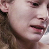
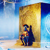
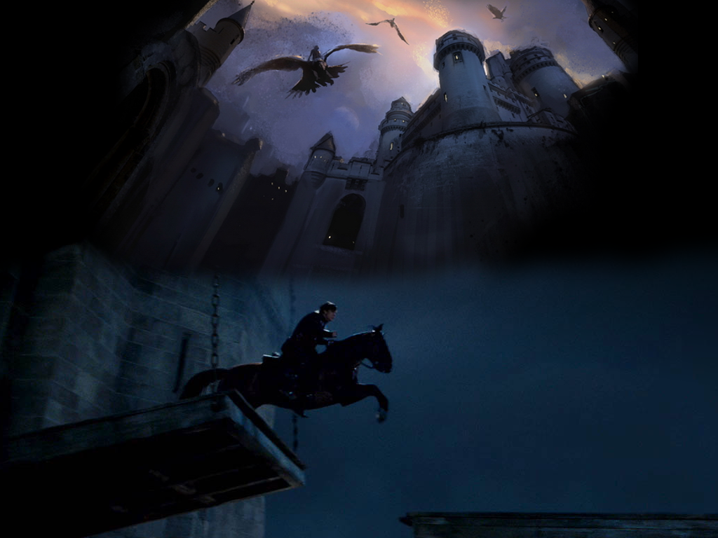
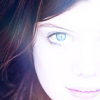
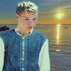
 to this:
  recreating this:
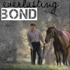
 Requested by lover of narnia.
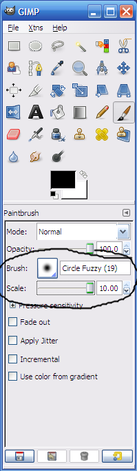
Open and prep image/base (crop, scale, etc.). I'm using a base from don't_be_so_base.
Duplicate the base layer and set it to Screen at 100%.
Duplicate your image (not the layer) by pressing Ctrl+d on your computer keyboard. Merge the Screen layer to the background layer (on the duplicated image). Now, copy and paste the duplicated image back into the original image and set it to Soft Light at 50% (it should be on the top). You can close down the duplicate image now (you don't have to save it).
Select the Screen layer and reduce the opacity to 50%.
Add 3 fill layers of color #170920, set them to Screen, Screen, and Subtract all at 100% (the Subtract layer should be on the top. This is the equivalent of one Exclusion layer on other programs.).
Add a fill layer of color #170920, set it to Dodge at 100%.
Flatten your image.
Duplicate the base layer and go to Colors>Components>Channel Mixer and input these settings...
Red channel: +110, -10, -10.
Green channel: -5, +105, 0.
Blue channel: -5, -5, +110.
Make sure that Preserve Luminosity is unchecked. Click ok.
Add a fill layer of color #000000, set it to Soft Light at 100%. Add a layer mask, copy and paste the background layer into it.
Add 3 fill layers of color #170920, set them to Screen, Screen, and Subtract all at 100% (the Subtract layer should be on the top.).
Flatten your image.
Go to Colors>Hue-Saturation, input these settings...
Master: +25
Reds: +25
Click ok.
Add a fill layer of color #ffffff, set it to Soft Light at 25%. Add a layer mask, copy and paste the background layer into it. Now invert the layer mask (Colors>Invert).
Add a fill layer of color #324040, set it to Lighten Only at 100%.
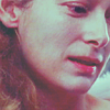
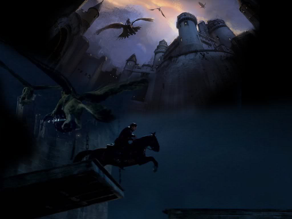
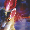
Flatten your image. It now looks like this:
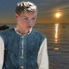
Go to Filters>Enhance>Sharpen and sharpen it to your liking.
Select the Blur/Sharpen tool and selectively blur her face and neck, and lightly sharpen her eyes and mouth.
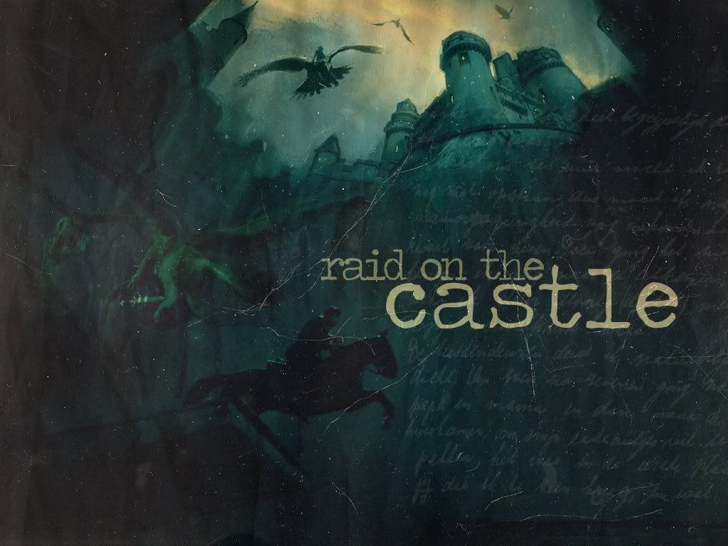
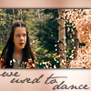
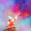
Add whatever else you want! I added some text and ended up with this:
You're done!
Please do not copy exactly.
--- flambeau

 to this
  recreating this
  .
.


 Ooh, just noticed that I also now have 875 posts!!!!!

 Set it on Lighten Only at 75%.
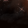 (made by
  (by
(by 
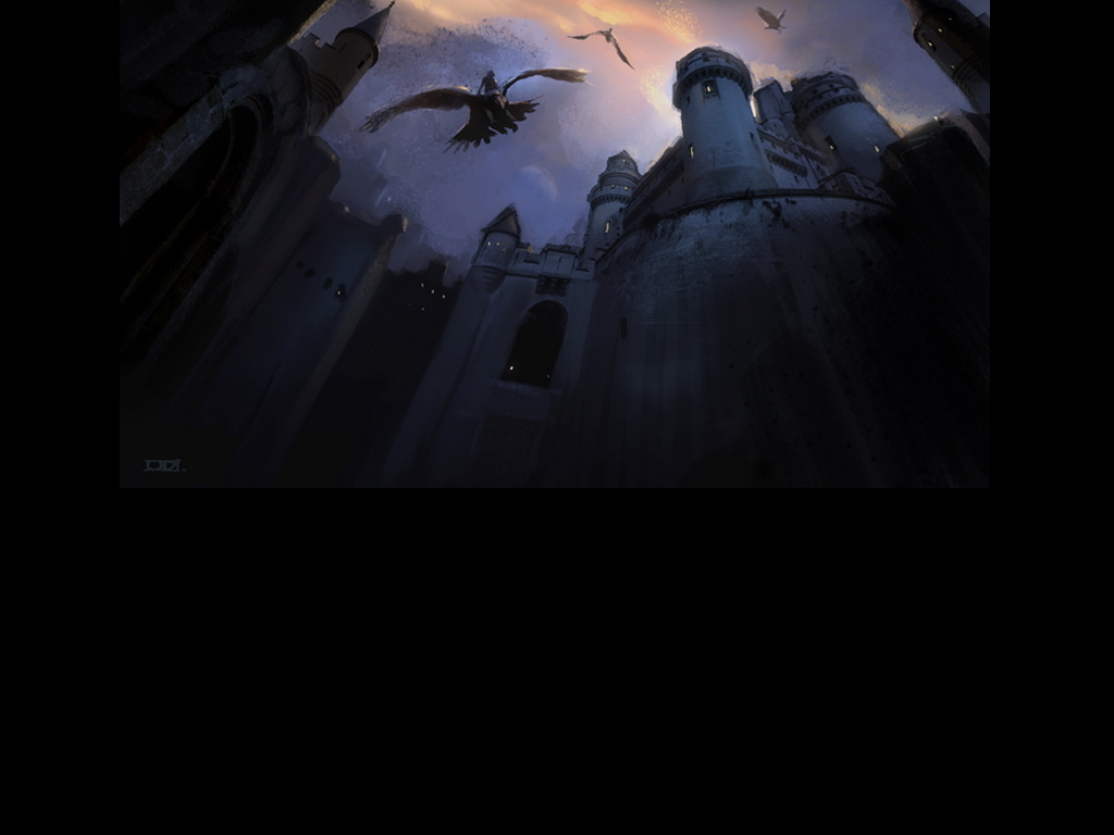
 To this:


 to this:


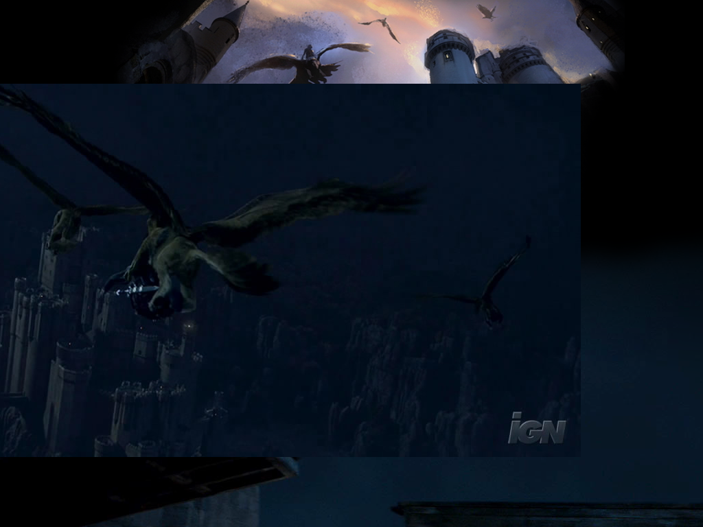
 [/url] (finished result)

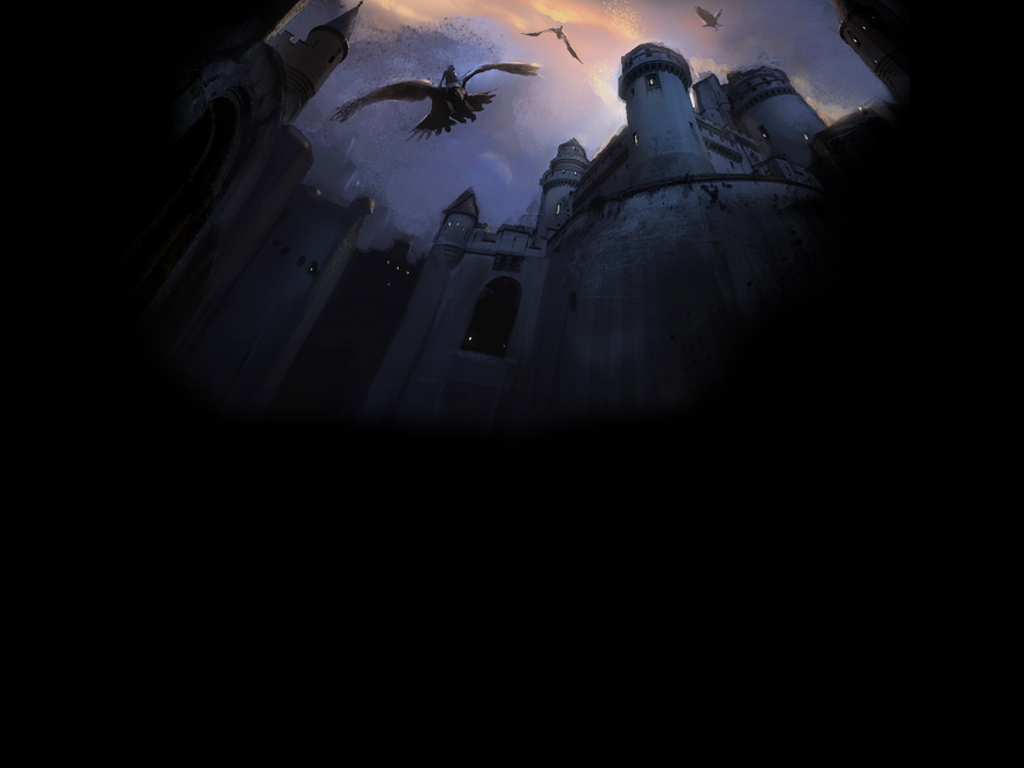
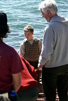
 to this:
 To this:


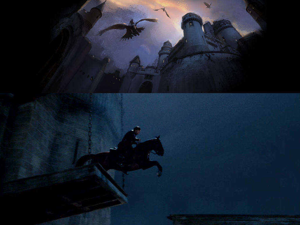
 and this:
 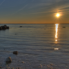 to this:
 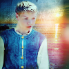 using Gimp. Translatable.
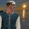
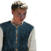
 set it to Soft Light at 50% (this added some slight shadows to Eustace, so the lighting matched a bit better).
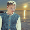


 , position it to your liking and set it to Lighten Only at 100%.
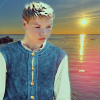
 , set it to Grain Extract at 75%. I selected the Blur/Sharpen tool and blurred the part covering Eustace.
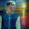
 , position it to your liking and set it to Screen at 100%. Blur it slightly.
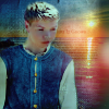
 set it to Soft Light at 75%.
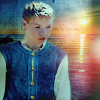
 , set it to Soft Light at 100%.
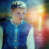
 , set it to Soft Light at 65%.
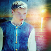
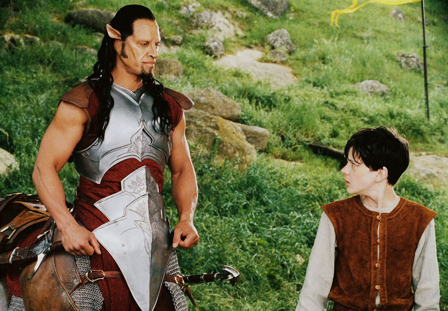
 to this:


 To this:
  A recreation of this:


 to this:
  recreating this:

 (It's not exactly the same as on my original banner because I had to recreate it.
 >>
>> 


 >>
>> 


