Re: Non-Narnian Graphics: Second Round


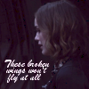
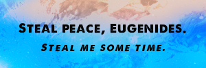
1: Mirror, Mirror
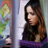
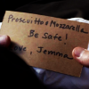
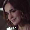
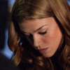
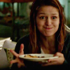
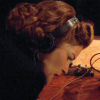
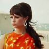
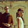
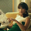
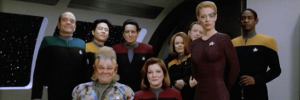
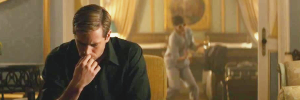
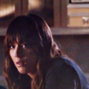
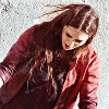
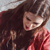
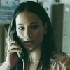
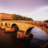
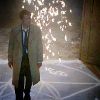
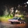
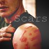
2-8: Saving Mr. Banks
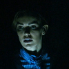
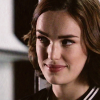
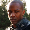
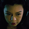
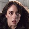
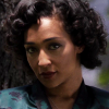
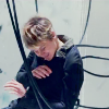
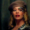
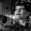
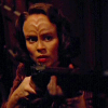
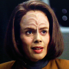
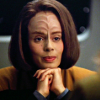
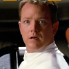
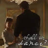
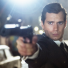
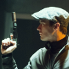
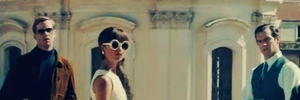
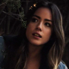
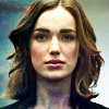
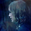
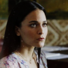
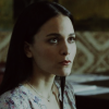
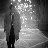
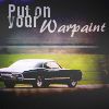
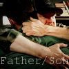
9-17: The Librarians
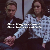
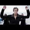
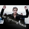
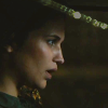
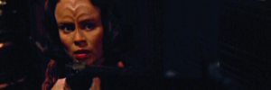
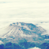
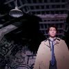
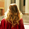
18-20: Alice in Wonderland
Textures by flambeau, Wunderkind_Lucy, and Aravis Autarkeia.
Anyone can use.
Your Source For Narnia Movie News
https://forum.narniaweb.com/


 On your first post, I especially love #1, #14, #15, #17, & #19. Then on the second post, #3, #5, #9, #13, #14, #15, and #16; the last one is quite cute too! (Are you liking The Librarians? It looks fun but I haven't seen it.)
 If you're not happy with the words, you might try stacking several layers of text on top of eachother, perhaps blurring the bottom layer or two a little or offsetting it a tiny bit to create an illusion of depth and make it "pop" some. That'll also sometimes help if you've got a busy background or one that changes from light to dark or vice-versa behind the words. What editing program do you use? The graphics look good!

 SummerSnow is using #12 & #15 right now, though, so please hold off on using either of those until she's done; thank you!
 ValiantArcher wrote:(Are you liking The Librarians? It looks fun but I haven't seen it.)


 It sounds like a neat program! I'll have to try to catch it sometime!
Dot wrote:Textures by flambeau, Valia, Aravis A, hyaline12, and Wunderkind_Lucy.
I'm drawing a blank. 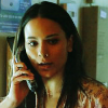


 Your coloring and cropping continue to be very nicely done. Maybe the text could be more centered? I'm not quite sure, sorry. Nice work on all of the recent graphics.
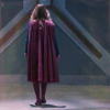

 Movie 4 will premiere on Hallmark Movies & Mysteries in September. The cast and crew are filming movie 5 in Vancouver.
  https://www.youtube.com/watch?v=0R2OzjgmDNk